
CASE STUDY
PRINTED FOOD MOVEMENT
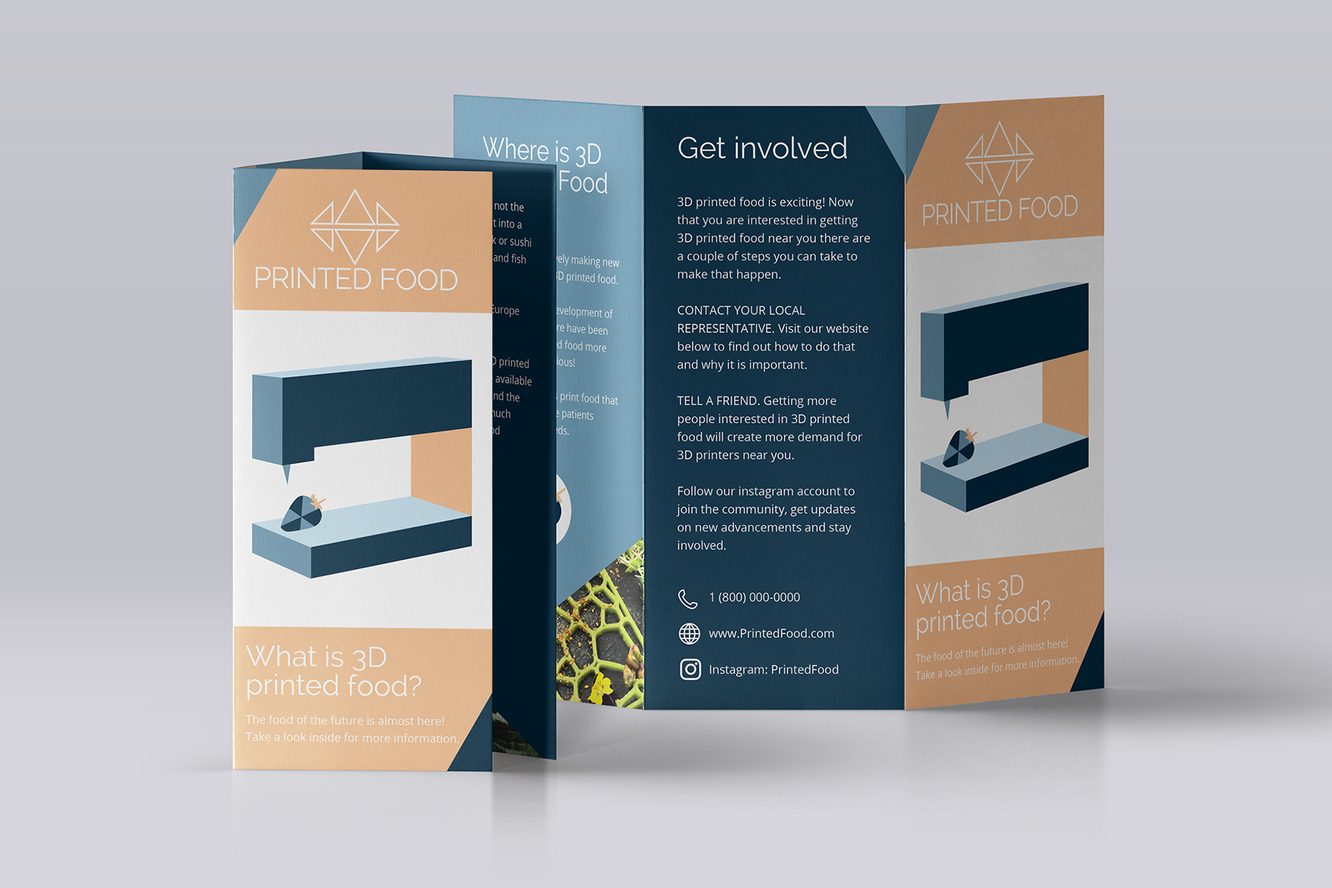
PRINTED FOOD is a hypothetical non profit organization that informs people about the benefits of 3D printed food and is committed to starting a movement to bring 3D printed food to United States. Many Americans experience food insecurity while the food waste in the United States is over 80 billion pounds per year. 3D food printers recycle food, which lowers food waste and provides more people with food which then lowers the amount of food insecurity in the US.
OVERVIEW
For this project I was faced with the task of solving the problem of minimizing food insecurity in elementary school children. It came to me to not focus on a quick solution that would not last but promote a solution that the future of food is heading in anyway.
For this project I was faced with the task of solving the problem of minimizing food insecurity in elementary school children. It came to me to not focus on a quick solution that would not last but promote a solution that the future of food is heading in anyway.
OBJECTIVES
My goals for this project were to create a demand for 3D printed food by informing the public about the benefits of printed food and getting the word out that the technology for printed food exists.
My goals for this project were to create a demand for 3D printed food by informing the public about the benefits of printed food and getting the word out that the technology for printed food exists.
To reach a wide audience I have created a website landing page, social media advertisements and a brochure. With these deliverables PRINTED FOOD will reach people digitally and through print. The modern layout and trendy color palette will pique the interest of the public and make reading about 3D printed food enjoyable.


CHALLENGES
Most people in the United States do not know that 3D food printing exists which means there is currently little to no demand for it. This gave rise to the question "How can I make learning about 3D printed food interesting and enjoyable?".
Most people in the United States do not know that 3D food printing exists which means there is currently little to no demand for it. This gave rise to the question "How can I make learning about 3D printed food interesting and enjoyable?".
APPROACH
To stay true to the aesthetic of 3D printed food I decided I wanted to create geometric patterns but to keep it fun by placing it on food shaped flat icons. Across all of the deliverables there are geometric shapes mixed with images of printed food to tie together the idea that printed food can look strange at first but it is simple food printed geometrically. Since it is very customizable food can be printed in an endless amount of fun shapes.
To stay true to the aesthetic of 3D printed food I decided I wanted to create geometric patterns but to keep it fun by placing it on food shaped flat icons. Across all of the deliverables there are geometric shapes mixed with images of printed food to tie together the idea that printed food can look strange at first but it is simple food printed geometrically. Since it is very customizable food can be printed in an endless amount of fun shapes.
EARLY DESIGN STAGES
The use of blues and geometric shapes were part of the process since the first prototypes. The evolution of the social media advertisements went from hand drawn spiral designs to more flat icon designs. The last advertisement it where the printed strawberry made its first appearance.
The original logo look had the bold spiral design as well. After researching modern logos I settled on a thin font (Raleway) with simple geometric shapes for decorative value. One of the first prototypes even included children sticker designs. Thank goodness for user testing, right?
EVALUATION
To get the designs to their final appearance took a lot of research, inspiration, feedback and user tests. Not to mention a lot of trial and error. The next steps for PRINTED FOOD will be evolving the design even further as more feedback and updated research comes in.
To get the designs to their final appearance took a lot of research, inspiration, feedback and user tests. Not to mention a lot of trial and error. The next steps for PRINTED FOOD will be evolving the design even further as more feedback and updated research comes in.


